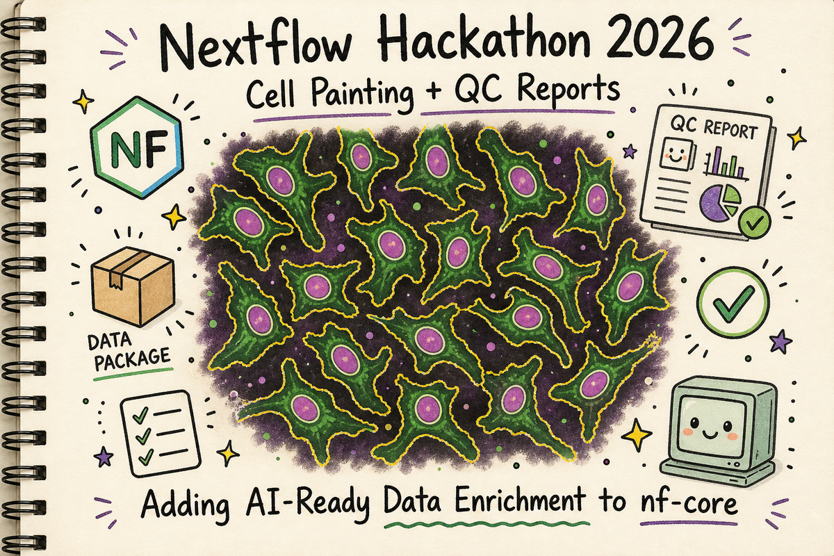
Nextflow Hackathon 2026: Adding QC Reports to nf-core/cellpainting (and Why Data Visualization Matters for AI)
Overview
I just got back from the Nextflow 2026 Hackathon, and it was exactly what my software engineer soul needed. Two days of focused open-source work, surrounded by people who get genuinely excited about workflow orchestration and reproducible pipelines.
More importantly one of the projects was based around cellpainting.
What is Cell Painting?
Cell Painting is a high-throughput, image-based assay used in drug discovery and biology to analyze cellular changes by staining cells with fluorescent dyes. It highlights up to eight major components—such as the nucleus, ER, and mitochondria—to generate "morphological profiles," allowing researchers to see how cells respond to drugs or genetic changes.
The Hackathon: Open Source is Good for the Soul
I submitted a PR to add QC reporting modules to the nf-core/cellpainting pipeline, and along the way, I got to play with the Nextflow Quilt plugin for data management. This isn't just about adding some notebooks to a pipeline. This is about enriching our data for the AI agents that are enroute. (As a side note I am in full on existential crisis over my coding myself out of jobs with AI agents. I am a problem.)
I've been wanting to contribute to nf-core for a while. The Cell Painting pipeline was a perfect target because:
- I love cellpainting
- It's actively being developed
- It handles high-content microscopy data (pretty cells!)
- It was missing some QC reporting that I knew would be useful
- The maintainers were at the hackathon to help review
The hackathon goal: add automated reporting modules that generate metadata summaries and descriptive statistics from the CytoTable parquet outputs.
The self-serving goal: Indoctrinate the other bioinformatics pipeline engineers into the cult that is generating lots of reports.
What I Built: QC Modules for CytoTable Outputs
The Cell Painting pipeline uses CytoTable to convert CellProfiler CSV outputs into analysis-ready parquet files. These parquet files contain morphological features extracted from microscopy images—things like cell size, nuclear intensity, cytoplasm texture, etc.
But once you have a parquet file, you need to know what's in it. How is it structured? How do the column names map back to our sample sheet? Do the distributions look reasonable? Are there any obvious data quality issues?
That's where my PR comes in. I added two new reporting modules:
1. Metadata Extraction Module (cytotable/metadata)
Extracts structural information about the parquet file:
- File info (name, size, path)
- DataFrame overview (rows, columns, total data points)
- Column structure by compartment (cells, nuclei, cytoplasm)
- Metadata columns list
- Data types summary
Outputs:
- Marimo app (.py)
- Structured metadata JSON (.json)
- Optional HTML report
- Optional Jupyter notebook export (.ipynb)
2. Descriptive Statistics Module (cytotable/descriptivestats)
Generates comprehensive stats and visualizations:
- Summary statistics for ALL numeric columns (count, mean, std, min, quartiles, max)
- High-quality plots (300 DPI PNG):
- Cell, nuclear, and cytoplasm size distributions
- DNA intensity distributions
- Missing values analysis
- Feature categorization by compartment and measurement type
Outputs:
- Marimo app (.py)
- Statistics parquet file (.parquet)
- Optional PNG plots (300 DPI)
- Optional HTML report
- Optional Jupyter notebook export (.ipynb)
Both modules use marimo to create reactive Python notebooks. They're reproducible, automated, and generate both human-readable reports and machine-readable outputs.
Here's what the workflow looks like now:
CELLPROFILER_ANALYSIS → CYTOTABLE → CYTOTABLE_METADATA
                                   → CYTOTABLE_DESCRIPTIVESTATS
Plot Twist: Discovering Marimo at the Hackathon
Here's where the hackathon paid dividends. I initially built these modules using Papermill and Jupyter notebooks. Standard stuff. Works fine, but notebook make for terrible git diffs. I was asked if I'd heard of Marimo.
I had not!
Marimo is a reactive Python notebook framework that generates .py files instead of .ipynb files.
Learning about Marimo led me down a fun cascade. I learned about Seqera containers. No need to build my own containers!
Reports, reports, reports
As a quick side rant I am a big believer in generating reports for all the files. A big part of my job is to take on pipelines from scientists. The scientists are the domain experts and they drive the design of the pipelines.
Understanding the file types, the structure, and some basic descriptive statistics is always helpful. For me, for the scientists.
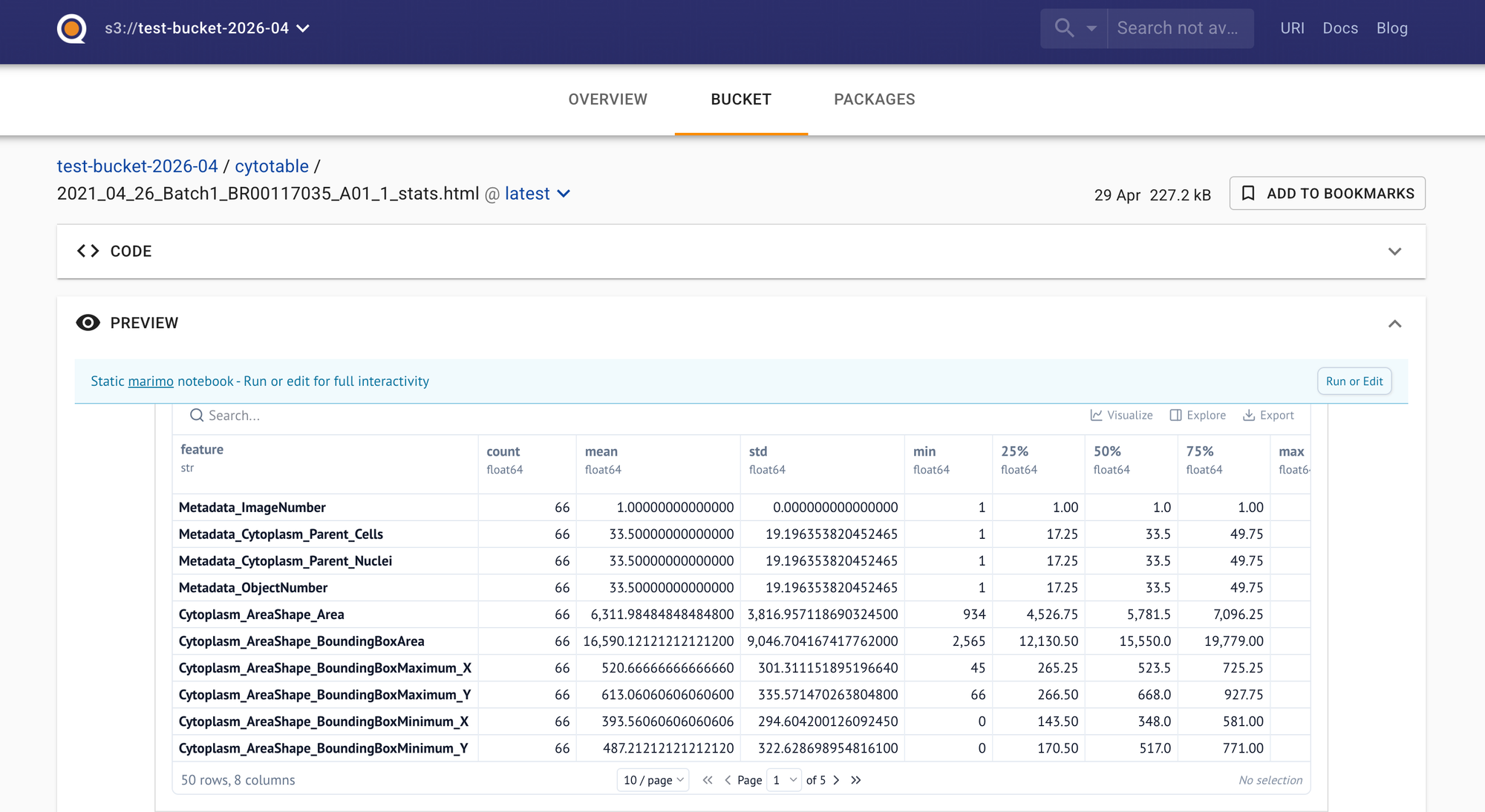
Reports are an excellent communication tool. The screenshot above was produced with the Nextflow powered marimo module. The html report is very nicely displayed in Quilt. We have plenty of tech problems, but we have considerably more people problems. Make demos. Build visualizations. Go talk to some humans and not just the AI!
The Module
Running the module in the Nextflow pipeline looks like this:
script:
"""
marimo export html ${prefix}_stats.py \\
    -o ${prefix}_stats.html \\
    -- \\
    --parquet-file ${parquet_file} \\
    --output-prefix ${prefix}
"""
The marimo export html command executes the app and generates the HTML report in one shot. The HTML reports is an artifact that a scientist can view, or that we can display in an interface like Quilt.bio.
The Quilt Side: Why Data Cataloging Matters
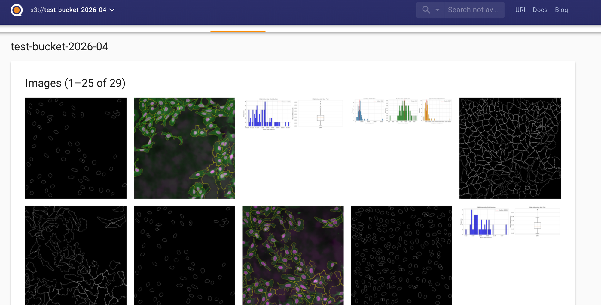
The OSS version of Quilt is a real fancy S3 browser that displays html, ipynb along with csv and parquets as nicely rendered tables.
I ran the updated pipeline using the Nextflow Quilt plugin, which pushes all outputs to a Quilt data package on S3. The Quilt UI is a tool I love handing to scientists.
Look at this:
Pushing our Nextflow pipeline results gives us a data catalog that:
- Renders Jupyter notebooks in-browser
- Displays Markdown READMEs with full formatting
- Shows HTML reports directly
- Previews parquet files and CSVs with interactive tables
- Displays images and plots
- Provides a search and query interface
And here's the stats report, rendered beautifully:
See those plots? Those size distributions? The summary statistics? All rendered directly in the browser. No downloading files from S3. No setting up Cyberduck! No "let me spin up a Jupyter server." Just navigate to the package and explore.
How Quilt Packages Map to Nextflow Modules
Here's a peek at the generated packages:
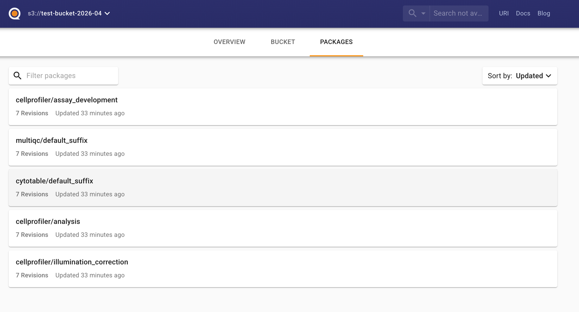
Each run creates a versioned package with all outputs organized by stage.
One of the clever things the Quilt plugin does is automatically organize outputs by module. The Quilt package structure mirrors the Nextflow module structure, which makes it trivial to understand what came from where.
Here's the mapping:
Quilt Package Name                    ←→  Nextflow Module Path
─────────────────────────────────────────────────────────────────────────
cellprofiler/illumination_correction  ←→  modules/local/cellprofiler/illuminationcorrection/
cellprofiler/assay_development        ←→  modules/local/cellprofiler/assaydevelopment/
cellprofiler/analysis                 ←→  modules/local/cellprofiler/analysis/
cytotable/default_suffix              ←→  modules/local/cytotable/
multiqc/default_suffix                ←→  modules/nf-core/multiqc/
And the new QC reporting modules I added will also show up in their own packages:
cytotable_metadata/default_suffix     ←→  modules/local/reports/cytotable/metadata/
cytotable_descriptivestats/...        ←→  modules/local/reports/cytotable/descriptivestats/
This means when you're browsing the Quilt catalog, you can immediately trace each output back to the exact Nextflow module, or the custom output path, that generated it.
The package structure looks like this in the Quilt UI:
📦 your-bucket/cellpainting-run-2026-04-30/
├── 📁 cellprofiler/
│   ├── 📁 illumination_correction/
│   │   └── 📄 Batch1_Plate1_IllumAGP.npy
│   │   └── 📄 Batch1_Plate1_IllumDNA.npy
│   │   └── ...
│   ├── 📁 assay_development/
│   │   └── 📄 QC_output_A01_site1.png
│   │   └── ...
│   └── 📁 analysis/
│       └── 📄 Batch1_Plate1_A01_1_Image.csv
│       └── 📄 Batch1_Plate1_A01_1_Cells.csv
│       └── ...
├── 📁 cytotable/
│   └── 📄 Batch1_Plate1_A01_1.parquet
│   └── 📄 Batch1_Plate1_A02_1.parquet
│   └── ...
├── 📁 cytotable_metadata/
│   └── 📄 Batch1_Plate1_A01_1_metadata.py
│   └── 📄 Batch1_Plate1_A01_1_metadata.json
│   └── 📄 Batch1_Plate1_A01_1_metadata.html
│   └── ...
├── 📁 cytotable_descriptivestats/
│   └── 📄 Batch1_Plate1_A01_1_stats.py
│   └── 📄 Batch1_Plate1_A01_1_descriptive_stats.parquet
│   └── 📄 Batch1_Plate1_A01_1_size_distributions.png
│   └── ...
└── 📁 multiqc/
    └── 📄 multiqc_report.html
    └── 📄 multiqc_data/
Each package is versioned, so you can track changes across pipeline runs. Click on a package, and you see all the files from that stage. Click on a file, and Quilt renders it (if it's a supported format) or lets you download it.
Future Work - Context Enriching for AI Agents
I saw this post from Simon at Quilt and it got me thinking about my work on AI agents.
How you never want to just leave the AI without adult supervision, but that you want to give it as much context as you can. Of course, you can't fit multi GiB files into the context window, but you could fit a lot of enriched metadata about each file into the context window!
We're rapidly moving toward a world where AI agents will be the primary consumers of our data. Not just human scientists manually exploring CSVs. Not just dashboards with pre-baked visualizations. But autonomous agents that need to:
- Understand what data is available
- Determine if it's high quality
- Extract relevant features
- Make decisions about next steps
For this to work, our data needs to be enriched. It needs:
1. Structured Metadata
The metadata JSON tells an agent exactly what's in the parquet file without opening it:
{
  "file_info": {
    "filename": "2021_04_26_Batch1_BR00117035_A01_1.parquet",
  },
  "dataframe_info": {
    "rows": 1543,
    "columns": 2847,
    "total_data_points": 4391721
  },
  "column_structure": {
    "Cells": 1421,
    "Nuclei": 712,
    "Cytoplasm": 714
  }
}
An agent can read this and immediately know: "This is a Cell Painting dataset with 1543 cells, extracted features from three compartments, and it's about 12 MB."
2. Statistical Summaries
The descriptive stats parquet gives the agent a numerical understanding of the data:
- Which features have high variance?
- Are there any suspicious outliers?
- What's the dynamic range of each measurement?
This is the difference between an agent blindly running analysis and an agent making informed decisions.
3. Visual Representations
Humans are visual. Agents are learning to be. Those PNG plots aren't just for us—they're anchors for understanding distributions, spotting anomalies, and validating expectations.
When an agent can "see" that DNA intensity distributions are bimodal, it can infer that there's likely a biological signal (maybe cell cycle phase) worth investigating.
4. Rich README Context
With Quilt, we can include README.md files in our data packages that explain:
- What this experiment was
- What the columns mean
- Known data quality issues
- How to interpret the results
Agents can read these READMEs and gain context while scientists ask questions. This is huge.
The Quilt Plugin: Making Data Management Actually Pleasant
Running the pipeline with Quilt was surprisingly smooth. The Nextflow Quilt plugin handles the heavy lifting of pushing outputs to S3 and creating the data package.
The Bigger Picture: Data Enrichment as Science
We spend so much time building pipelines to generate data. But then we dump that data in S3 with minimal context, and wonder why it's hard to reuse. Specifically, pipeline engineers are known for handing results of a run off to scientists and skipping off into the sunset. With AI tools and context enrichment, we can begin to allow scientists to ask real questions of their data.
Adding metadata. Generating statistics. Creating visualizations. Writing READMEs. These aren't "nice to haves"—they're essential for making data usable at scale.
And with AI agents on the horizon, this becomes even more critical. An agent can't ask clarifying questions about your data. It can't intuit what you meant. It needs:
- Explicit schema information
- Statistical summaries
- Visual representations
- Contextual documentation
If we're serious about making biology data-driven, we need to invest in making our data discoverable, understandable, and enriched.
What's Next
The PR is submitted and under review. Once it's merged, the nf-core/cellpainting pipeline will automatically generate these QC reports for every run.
I'm also planning to extend the Quilt integration to include:
- Automatic README generation with run metadata
- Experiment metadata enrichment with papers, github repos, and any other resource I can get my hands on
- Cross-plate QC aggregation
- Outlier detection reports
- Links back to the Nextflow execution report
And I'm thinking about building a "data enrichment" module that can be plugged into any nf-core pipeline to automatically:
- Generate schema documentation
- Calculate summary statistics
- Create standard visualizations
- Build a Quilt package with README
Key Takeaways
✅ Contribute to open source. It's good for your skills, good for your soul, and good for the community.
✅ Be open to new tools. I learned about marimo because a maintainer suggested it. Now I'll use it in future projects.
✅ Automate your QC. Don't manually check data quality. Build reporting into your pipeline.
✅ Make outputs machine-readable. JSON, parquet, and structured formats beat plain text every time.
✅ Use Quilt (or similar) for data cataloging. A web UI for browsing data packages is a game-changer.
✅ Enrich your data. Add metadata, statistics, visualizations, and documentation. Your future self (and future AI agents) will thank you.
If you're interested in the nf-core/cellpainting pipeline, check out the official docs. If you want to learn more about Quilt, visit quiltdata.com. And if you haven't tried marimo, it's worth checking out for any data analysis workflow.
If you're thinking about attending a Nextflow hackathon: do it. You'll learn new tools, meet great people, and contribute something useful. What's not to love?
Next up: How to build AI agents that actually understand your bioinformatics data (hint: it starts with better data enrichment).